BRAND CASE STUDY
MISTICO

MISTICO
defined (MYSTIC IN ENGLISH)
a person who seeks by contemplation and self-surrender to obtain unity; who believes in the spiritual apprehension of truths that are beyond the intellect.
ABOUT mistico shop
Carmen Franco, CEO of Hello Mistico Shop, is a small business handmade jewelry shop located in South Texas, and mainly sells online locally and internationally. Carmen came to us, The Fun Studio, to help her create a personalized brand that would be special and unique to her beliefs. Out big question was, who is Carmen Franco? What are her believes? We learned that Carmen is connected with her inner being, her young spirit, and the forces of nature. Her craft began as a hobby, which then turned to her business by accident. All her handmade works are carefully crafted with much love, are visually stunning and in some cases she uses high quality specialty stones to bring protective energy and/or help chakra alignment, since the stones have much healing power.
IDEA AND BELIEF for brand development
Bringing meaning to life. We went ahead and did our own research, we contacted past clients and asked them about their experience with the jewelry and its craft, we gathered our data. But now we needed to find out more and go deeper into this journey and find more meaning, so we went to the source. After a long casual conversation with Carmen Franco, we were able to find the gravitas behind the direction we would need to take. For example, the “C” from Carmen and the “O” from her middle name Obdulia, which means “protector,” gave us more input to take into consideration to create a meaningful personal brand. We noticed, everything is interconnected, her name, her beliefs in spirituality, zen vibes, the chakras, along with the moon’s energy (for cleansing and purifying powers), the sun, universe, forces of nature, and earth—gave us one big equation, that helped us accomplish a unique, true brand for Carmen’s shop.
BRANDING
THE FOCUS
The mystic world, the forces of nature and the energy radiating from the sun and the moon upon earth, enrich lives, purify and bring peace to the inner-self for connection to the cosmic worlds and becoming a well balanced spirit in the physical world.
The branding needed to be one of a kind, something that was more of a mathematical equation, and adapt the colors of the universe and chakras. We looked into commonalities amongst various objects, from shapes to where they belong, how they look like, how are these objects portrayed to us, how does it serve us, how is this connected to us, how is this personable to the owner and to us? Our journey had commenced.
BRANDING EQUATION

EQUATION ADAPTATION


RESULT

TYPEFACE
SANS SERIF / GEOMETRIC / BOLD

COLOR STUDY

color Backgrounds
Colors may be used on their own, but best way to represent it’s true chakra essence of alignment, is by adapting a gradient style to bring a sense of glow and movement.

PHOTOGRAPHY DIRECTION
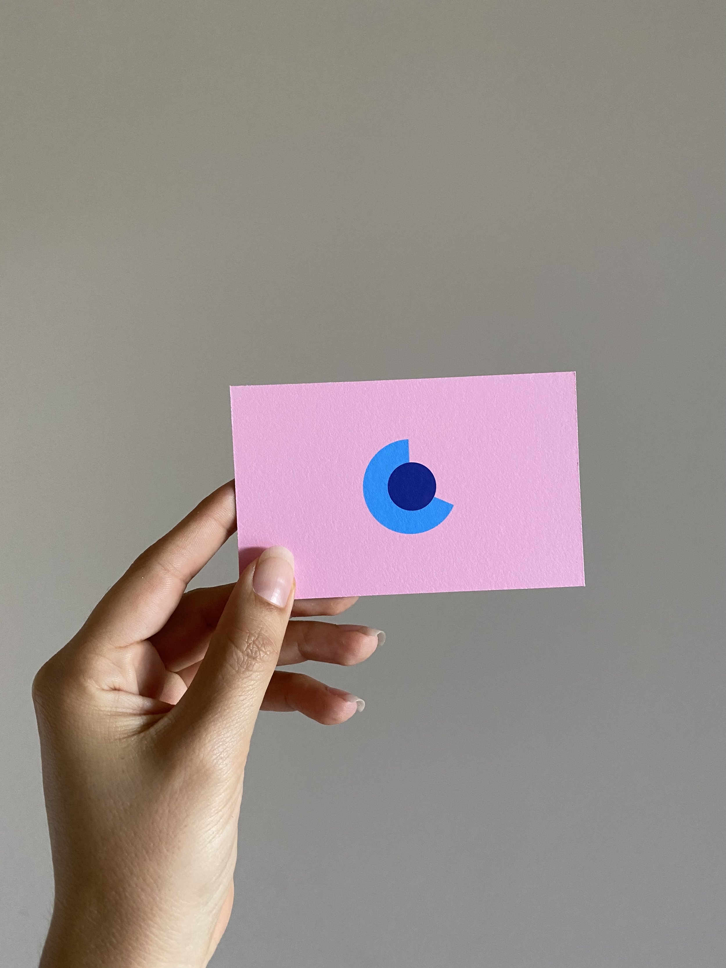
The goal is to focus on the bracelets, by having a stunning visually appealing hand model, with a very simple background (grays, whites, single muted color). Hands should be relaxed, not forced or in extreme awkward positioning.


PHOTOGRAPHY, BACKGROUND AND LOGO PLACEMENT
Pairing gradient background with gestural posed hands and branding should feel free flowing and delicate.